Created at YSYS x Create Jobs programme
Working with 4 other designers to create an interactive social app prototype for Reebok while learning about product design from industry leading professionals.
Using:
THE PROCCESS
Understanding users
Interviews:
Starting by structuring an interview that allowed us to gain a deep understanding of the way our users think about legacy and their futures.


Understanding the market
The market VS persona needs:
Laying out what our users want and need from a digital product helped us create a foundation for what to look for in the market. Using this comparison to find our mission.

Confident.
Ambitious.
Wants to share!

Unsure.
Anxious.
Needs support!
The Mission:
Connecting people. Giving a platform to showcase journeys.
Support wellbeing.
Sketching and Wireframing
Visualizing ideas:
To start the designing process, we each presented low-fidelity wireframes and our data-driven visions. We compared and discussed the strengths in each other’s sketches while referring to our mission statement to find what would fit it best.
When creating this, I focused on asking why, what and who. To have a clear sense of function for every feature.

The Look and Feel
Design Guidelines:
When moving to higher fidelity wireframes and working more independently in sections, (Home, Profiles, Wellbeing, Sign up, Explore), I took the initiative to propose a colour pallete with the key words: fresh, joyful and soft.
Later including buttons and some illustrations created for the wellbeing section:

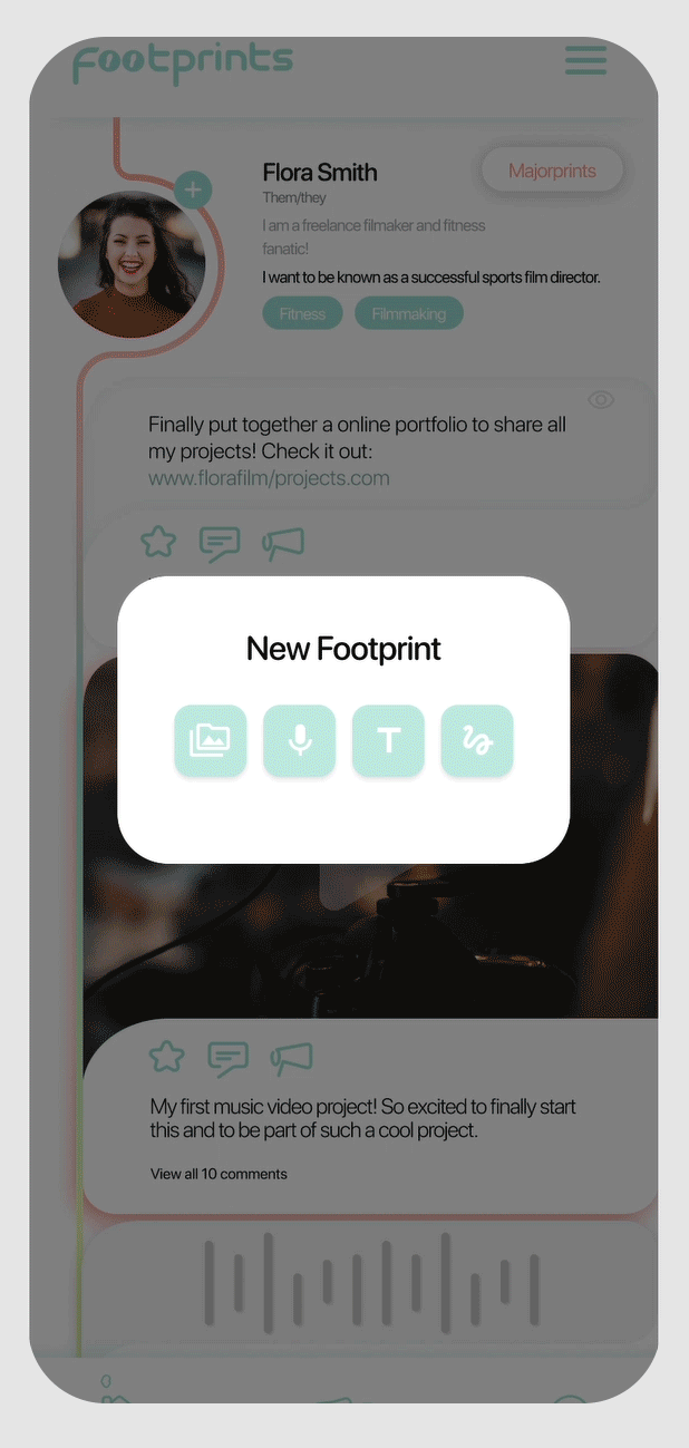
High Fidelity Prototype
Designing the profile section:

I focused on how users would post content, how it would be displayed, organized and viewed by others. Swipe to see sketch to prototype progress.

I continuously questioned and asked for feedback to make sure it was an enjoyable space to display/view accomplishments to inspire/be inspired. Exploring the wiring option on Figma and using motion to make it fun!
User Testing
Observing usage and analyzing feedback:

We tested several journeys: searching for people/content, main page interactions and posting a footprint. This feedback showed us clear ways to improve the user experience and develop the interface.
Improvements
Giving and Receiving Feedback:
By giving each other data-driven constructive feedback, we were able to edit our product with a strong user focus.

.png)
+ what would I do differently
I would focus less on connection and social features and build more on supporting well-being and motivation. Giving our users what they're missing most from the apps they already use.