Created at Urban Jungle | 2022
Urban Jungle Insurance is an insurtech using technology to challenge an outdated industry. My role was to contribute to building a simple, fair, and affordable product with the best-in-class UX and UI.
3 weeks | Cross-functional project | Data focused
Understanding the project
Project goals
What success would look like
From talking to the project managers and the partnerships team, I was able to better understand the goals of the project and the channel we're targeting:
My role in this project was to make sure the customer’s experience in this journey was kept easy, quick and frictionless while improving our average transaction value (ATV).
Price comparison website (PCW) - about the channel
People use our partner's website to find and compare multiple insurance policies. If the user chose to go with Urban Jungle, they would be directed to our website and complete their purchase there. For each policy sold, our partner would get a set amount - independent of the policy value.

User friendly MVP
Design a user-friendly journey with minimal resources

Higher ATV
Improving the average transaction value without hurting conversion
+
A/B Test to make sure conversion stays great

Our current journey VS competitors
Our current journey had a great conversion rate! From landing on our website to the payment page - we made it quick and easy for users to check their details, confirm important information and purchase their policy.
Unlike our competitors, we didn't ask them to get more add-ons or flash them with deals with crowded pages.
From previous user research interviews, we had heard that less time-committed users and users with less financial freedom, valued not being pressured to upsell.
Competitors
Multiple pages on the journey to persuade people to add more cover:
-
Long package pages
-
Add-ons on summary and payment pages
-
Scarcity copy
-
Dark UX patterns
.png)
Better ATV
Bad UX
Urban Jungle
Multiple pages on the journey to persuade people to add more cover:
-
No upselling
-
Fast journey to checkout
-
User friendly UX with accessible copy and simple UI
.png)
Good UX
Worse ATV
Exploring solutions
Ideation
Lo-fi wireframing and
Product/Engineering collaboration:
Current journey flow
To start putting ideas together, I drew out the current user flow and thought about how and where we could introduce ways to upsell the user.
While creating initial ideas, I continuously shared sketches and Figma files with the project's engineers to get feasibility feedback. I always had check-ins with the PM to check back on the project's scope and timelines.

From several paper sketches, I narrowed down 3 ideas that could help us improve our ATV from this journey flow and created these lo-fi wireframes:
.png)

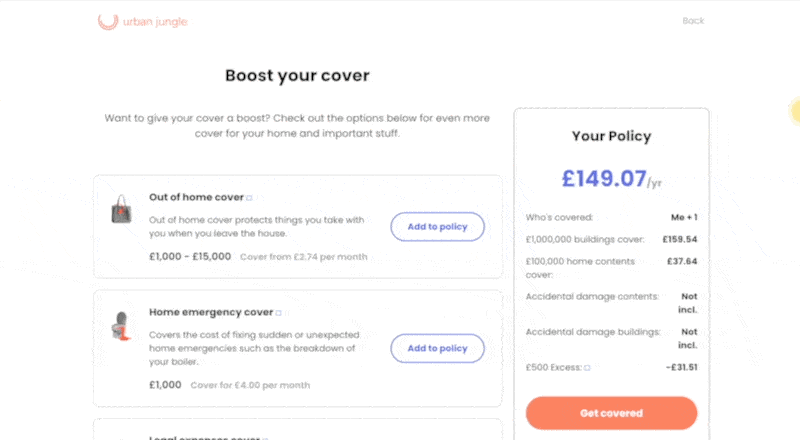
Idea 1:
add-ons on summary page
Keeps the user journey as short as it is now
Uses existing components - easy to build
Takes away the main action from this page
Looks crowded and could be confusing
.png)


Wireframing a final idea
It was helpful to gather feedback and understand the engineering limitations. This allowed me to make sure I iterated ideas into an MVP (minimal viable product). We also though a lot about our values and our mission to be transparent and give users the flexibility to build their cover instead of forcing them to cover things they don't need.
The concept we settled on covered
all those points:
Doesn't get in the way of other actions
Uses existing components - easy to build
Simple UX tested and proven on our own journey
Users can see how the addition affects their price
Unlike competitors we designed with user needs in mind and avoided the following:
Fearful and scarcity copy to make users feel they need to add more cover urgently
Not letting users continue until they interact with add-ons/packages

.png)
.png)
.png)
A/B Testing results
A/B Test findings and qualitative research
After setting up an A/B test function where 50% of users entering the partnership journey saw the additional page (varient A), we found the following from quantitative data:
-
~15% of users in varient A added more cover to their policy
-
Average transition value (ATV) was 2.5% higher for users in varient A
-
Conversion stayed the same for the two groups
Hotjar of a real customer using the page
Qualitative data from user interviews where there were no direct questions about this page showed us the following:
-
Most users mentioned how quick the journey felt compared to other providers
-
Some users found and considered add-ons they didn't know about or saw on the PCW
-
Users mentioned finding it useful to be able to add extra cover at that point in the journey
-
No users mention the journey feeling long or overbearing with add-ons
We were happy with these findings and expanded the use of the page to other products!
.png)